Press kit
Logos, colours, descriptions and screenshots for anyone writing about Brio UI. Use them as they are. For anything else, write to hello@brioui.com.
Descriptions
Short: Everyday React components, edge cases handled. Each one is a single file you copy into your project.
Long: Brio UI is a library of motion-first React components for the parts of a website that sell: pricing toggles, OTP inputs, FAQs, contact forms and changelogs. Each component is one file you own, and it imports only React and Motion. Every component is tested at the worst case: long strings, right-to-left text, narrow screens, slow CPUs, keyboard-only use and reduced motion. The free components are MIT licensed and install with npx brio-ui add <name> or the shadcn CLI. Brio UI Pro launches in November 2026 with a one-time price. Harjot Singh Rana builds it from New Delhi, India.
Name: Brio UI, or Brio for short. The npm package and CLI are brio-ui.
Logos
- Lockup, for light backgrounds: SVG · PNG
- Lockup, for dark backgrounds: SVG · PNG
- Symbol, for light backgrounds: SVG · PNG
- Symbol, for dark backgrounds: SVG · PNG
- Avatar, ink: PNG
- Avatar, paper: PNG









Keep clear space around the logo, and don't recolour, stretch or rotate it.
Colours
- Ink:
#17140fon light,#efe8daon dark - Paper:
#f1ece2on light,#13110eon dark - Surface:
#fbf8f1on light,#1c1915on dark - Coral:
#d4452bon light,#ff6b4aon dark
Type is Geist, with Instrument Serif italic for one accent word.
Screenshots
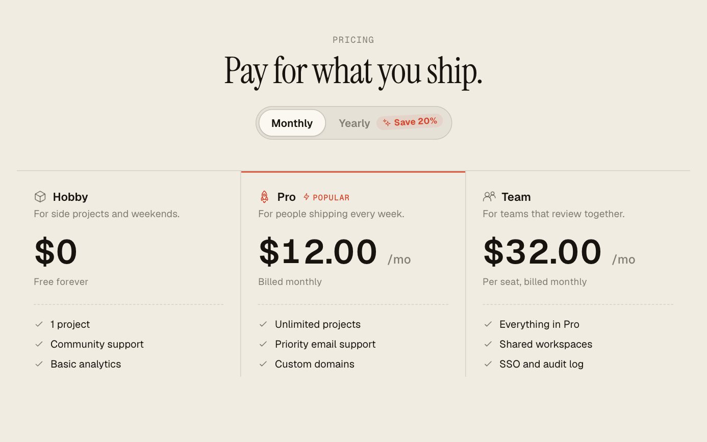
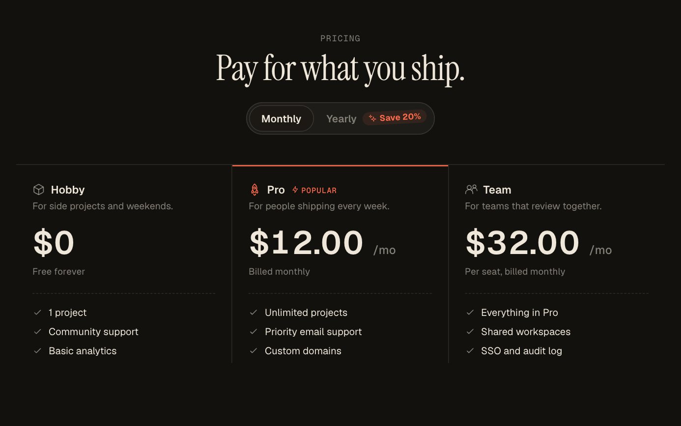
- Pricing Toggle: light · dark
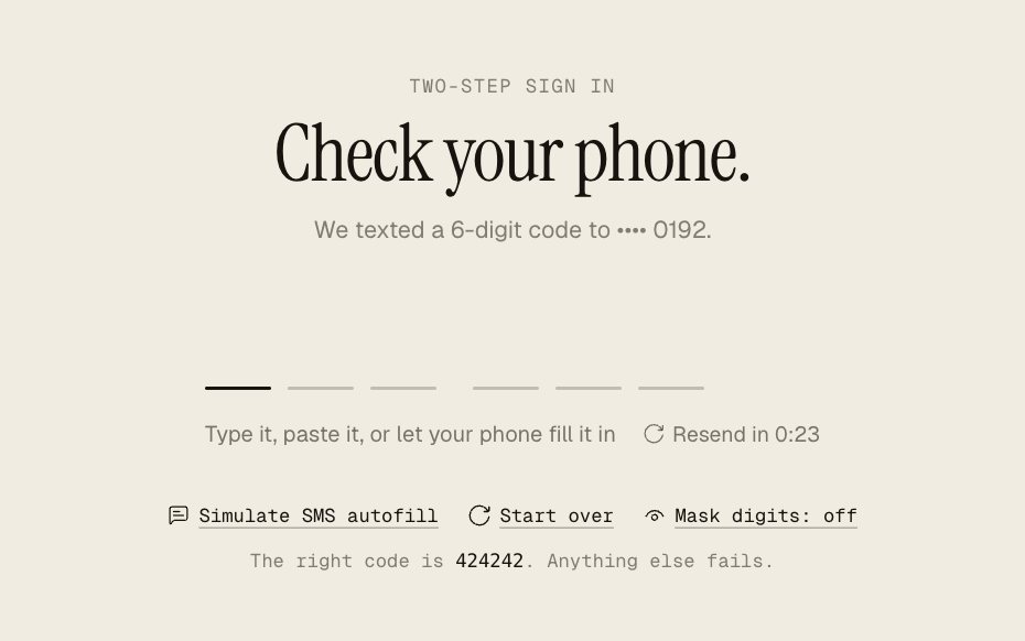
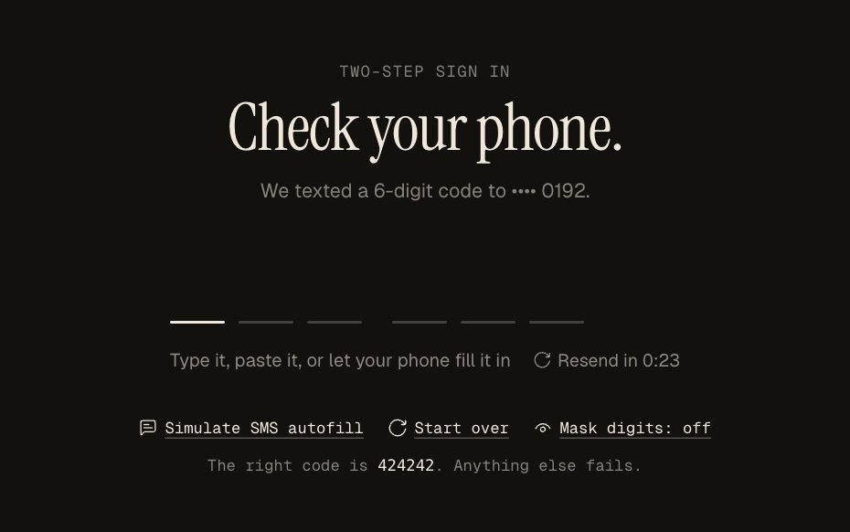
- Code Input: light · dark
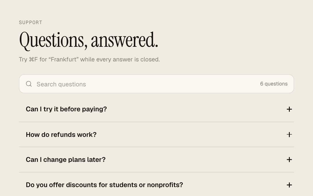
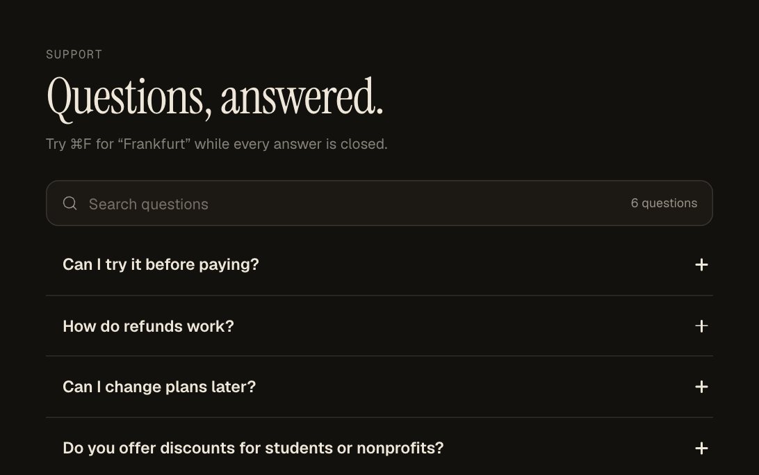
- FAQ: light · dark
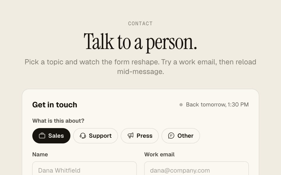
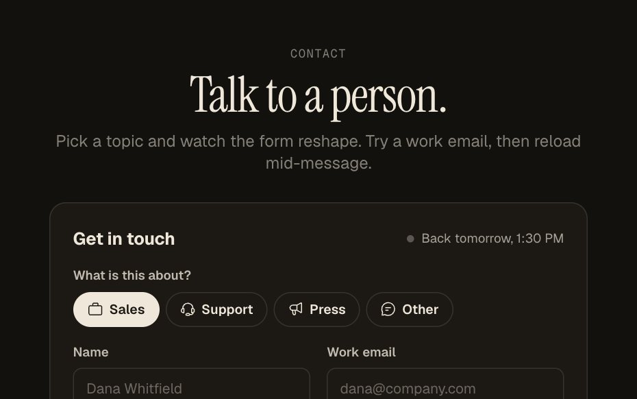
- Contact Form: light · dark
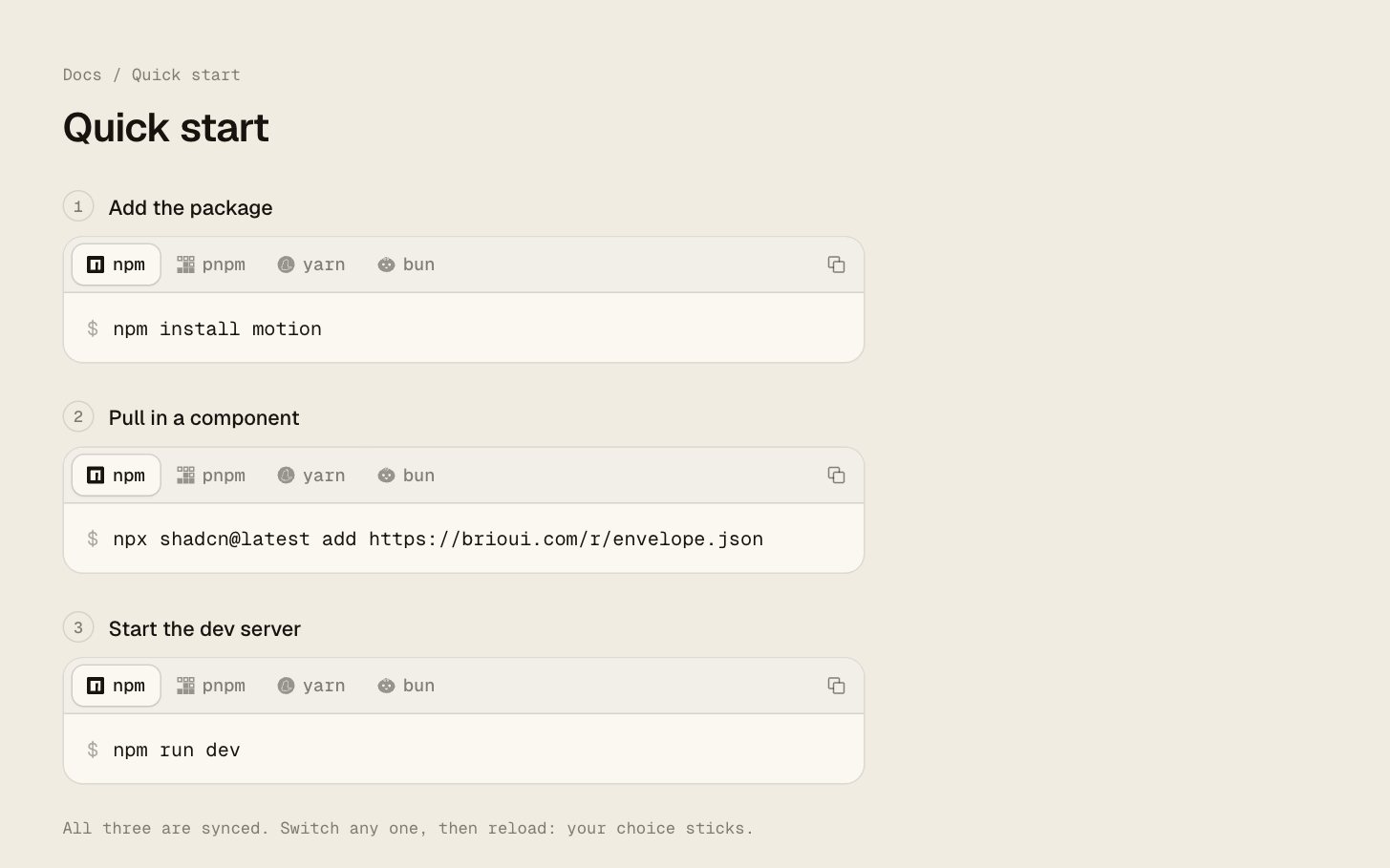
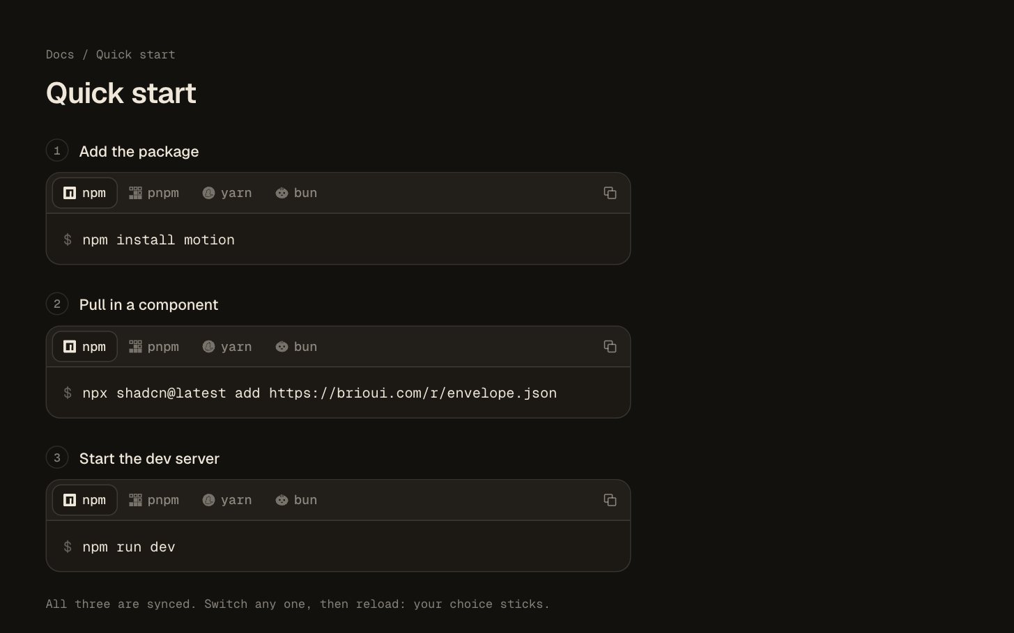
- Install Command: light · dark
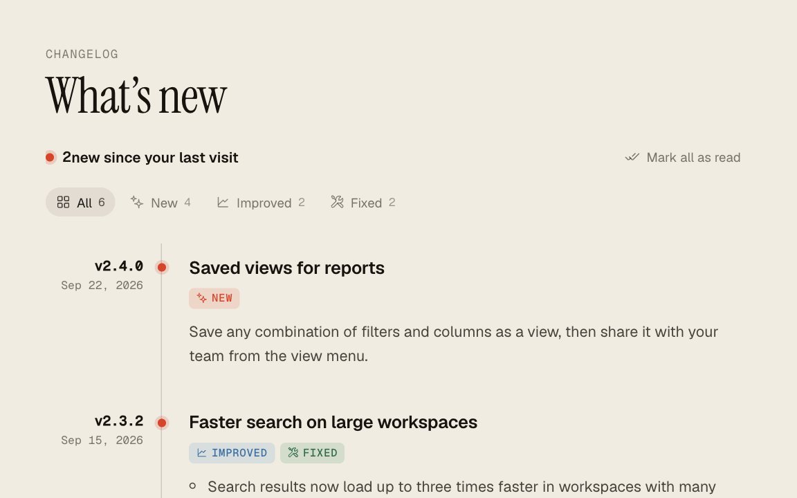
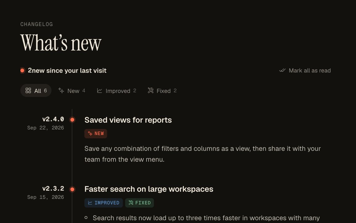
- Changelog: light · dark
Contact
Harjot Singh Rana, maker of Brio UI: hello@brioui.com. More about who makes it on the about page.